Blog: R statistics > D3.js Color scales > MapboxGL.js
For a assignment of the VNG my colleagues and me have been working on a data viewer containing the energy usage per building block of all the buildings in the Netherlands. A perfect dataset to statistically determine your color scales and a lot of data to nicely put in vector tiles and visualize with MapboxGL.js! In order to visualize such an amount of data I use the D3.js scales and color scales to create the map styling and legend. I send out a short tweet about what I was doing, and since there is so much interested, here is the blog!
Blog that up, that's worth sharing widely!
— Paul Ramsey (@pwramsey) June 12, 2020
A quick overview of the project
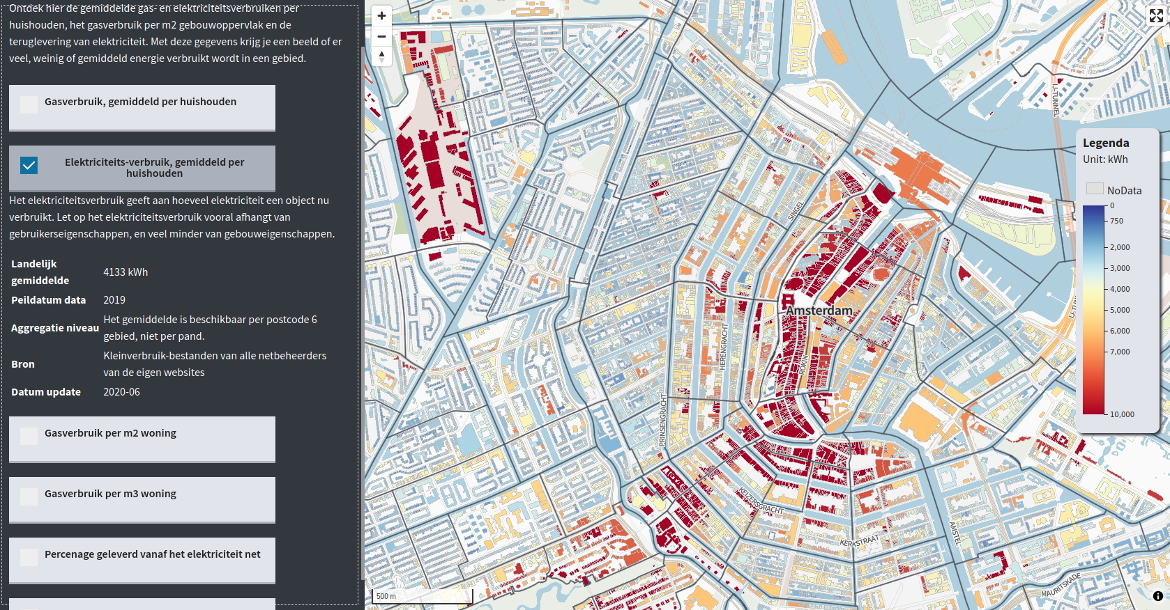
Have a look at the complete tool here: https://tvw.commondatafactory.nl/?layer=layer10&year=&tab=energie
- We use PostGIS for data preparation and calculations.
- we use Tegola to build our vector tiles from the PostGIS database.
- We build the tool in React.
- With MapboxGL.js we visualize the map.
- I use R studio to visualize the statistical distributions of the data attributes in order to determine the map colors.
- The color scale magic happens with D3.js Which also gives the opportunity to build corresponding color legends.
More about the project: https://commondatafactory.nl/
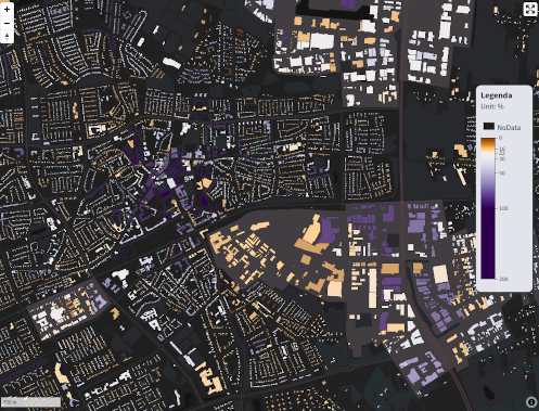
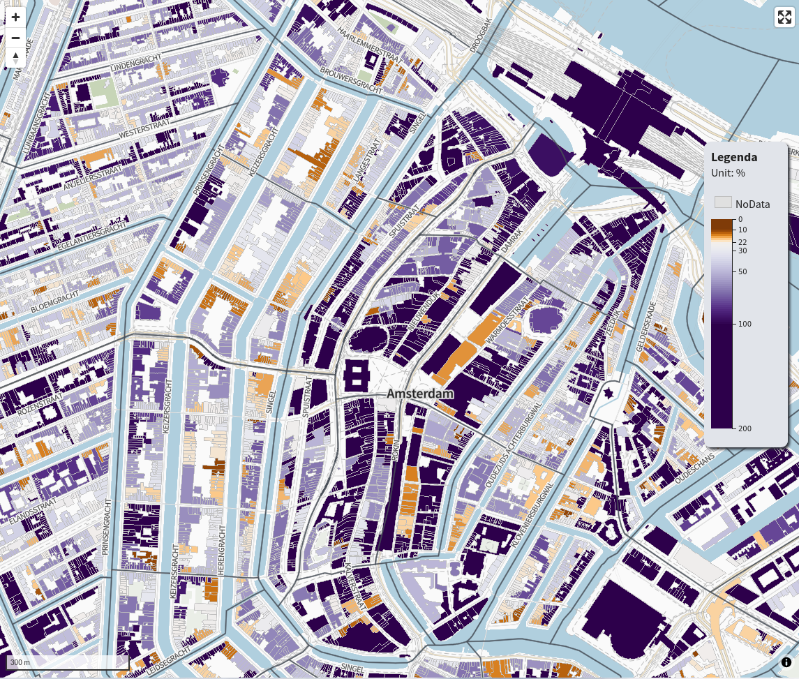
The image below shows the electricity usage per zip code in Amsterdam. As you can see the old inner city and some industrial areas at the edge use up a above average amount of energy. The national average is around 4133 kWh per household per year. In my original code I use multiple data layers and so multiple color scales are build. The code is open so check out the full react project on : https://gitlab.com/commondatafactory/energy/react-map/-/tree/TVWviewer
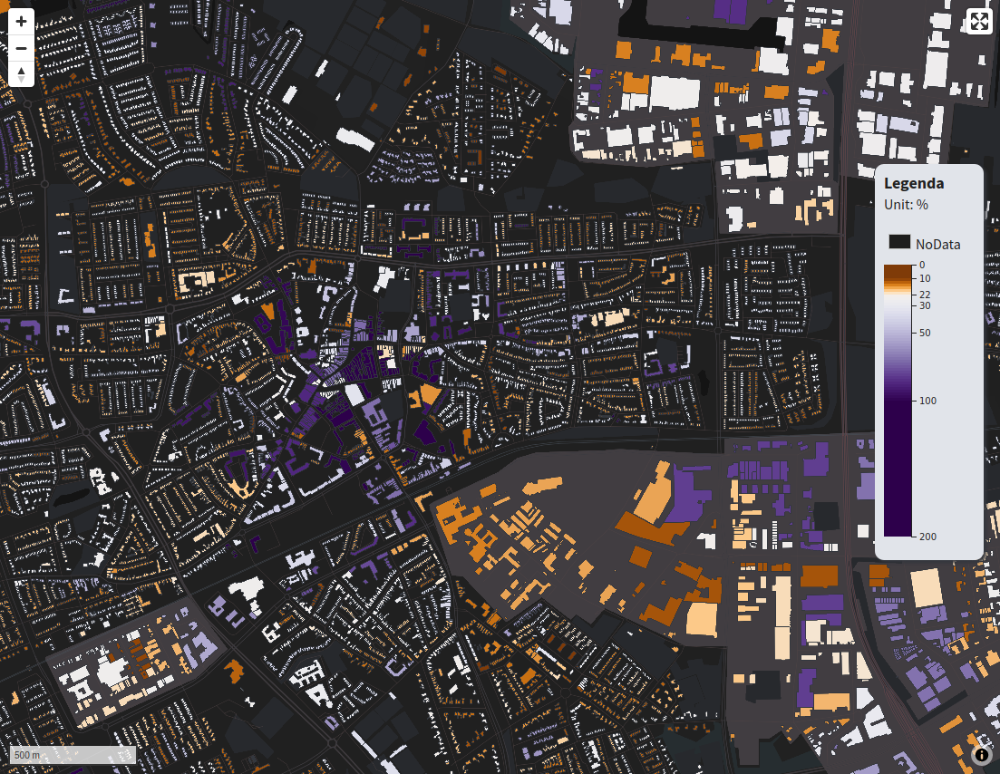
For this blog we focus on the dataset gas aansluitings dichtheid which means the density of connections to the gas supply net. The data is aggregated per zip code area but visualized on the buildings. It is a large dataset containing over 6 million records. Since residential and industrial areas are all included in the data, the value range is very broad! It is important to show the differences between residential and industrial but we do not want to loose the differences between buildings in the residential areas.
So let’s have a look at the dataset.
R studio
Get data to R
First thing to do is make a database connection with R so we can have a look at our statistical distribution in the attributes.
### DATABASE Connection
con <- DBI::dbConnect(
  "PostgreSQL",
  host = "localhost",
  dbname = "vng",
  port = 5432,
  user = "postgres",
  password = "postgres"
)

## Get data
data <- dbGetQuery(con, 'SELECT
  bouwjaar,
  gasm3_2020,
  kwh_2020,
  gasm3_per_m2,
  gasm3_per_m3,
  kwh_leveringsrichting_2020,
  gas_aansluitingen_2020
FROM "3dbag".energiepanden')
Basic Statistics
I do not know much about statistics, but I do know the basics! R studio is a great tool for this because it can quickly give you the stats and visualize them! Just checkout the summary first. Plot a histogram and a boxplot of the data.
#gasaansluitingsdichtheid
aansluit <- data$gas_aansluitingen_2020
summary(aansluit)
aansluit <- na.omit(aansluit) #Omit all NA values
hist(aansluit)
boxplot(aansluit, horizontal = T)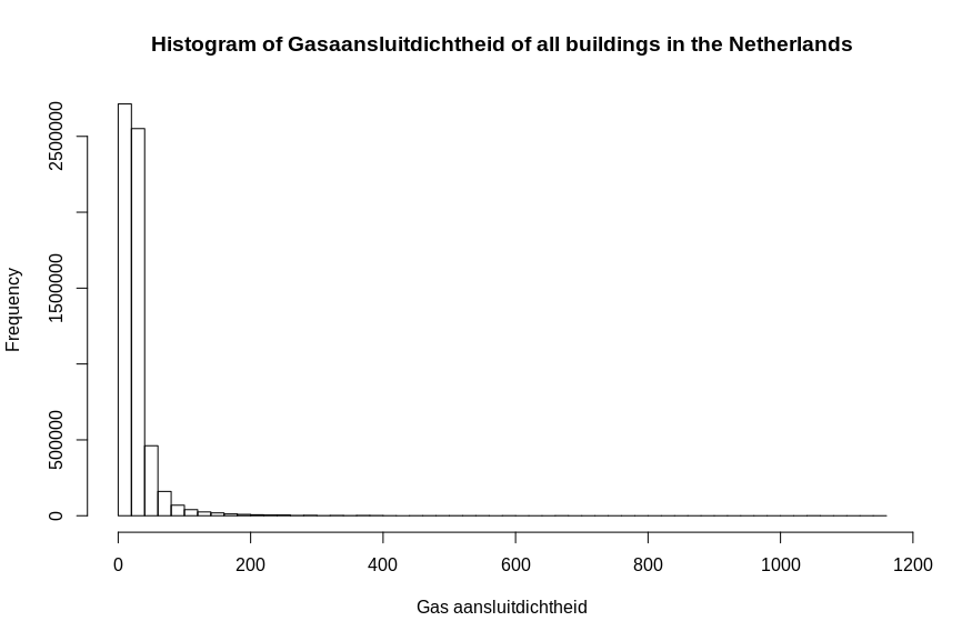
As you can see There is a large amount of outliers which prevent you from viewing the major part of the data thouroghly. I made a subset of the data to exclude the outliers and have a better look at the distribution of the main part of the dataset.
aansub <- aansluit[aansluit < 200]
hist(aansub, breaks=50)
summary(aansub)
quantile(aansub)
Again plot the histogram, boxplot and show some stats as summary and quantiles, now it is much more detailed.
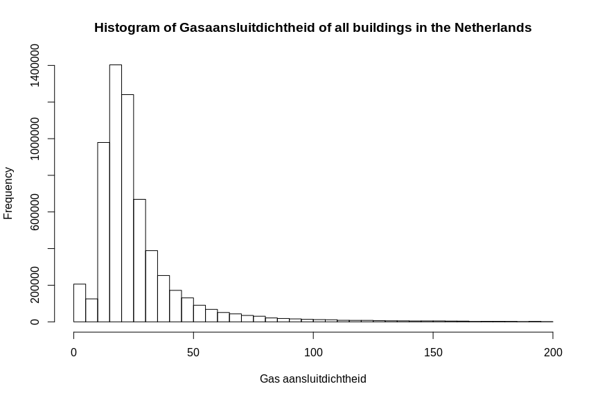
summary(aansub)| Min. | 1st Qu. | Median | Mean | 3rd Qu. | Max. |
|---|---|---|---|---|---|
| 0.00 | 16.00 | 22.00 | 26.83 | 30.00 | 199.00 |
quantile(aansub)| 0% | 25% | 50% | 75% | 100% |
|---|---|---|---|---|
| 0 | 16 | 22 | 30 | 199 |
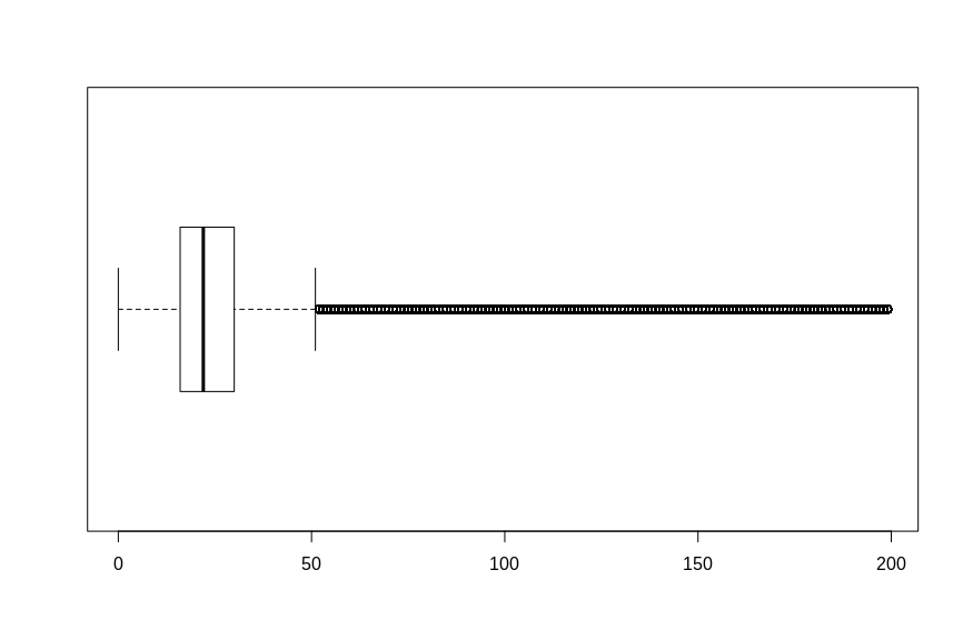
As you can see the average and median are around the 22% and 26% density. There is also a large amount of 0% densities and a lot of outliers. Given is that the dataset contains a lot of inaccuracies, and I assume the outliers above 100% is just a lot of density and therefore the differences between 100, 200 or even 500 is not interesting.
But the large amount of 0% values still seem like a discontinuity in the dataset. I decided to look further and plot a cumulative frequency diagram.
plot.ecdf(aansub, verticals = TRUE, col.hor = "red")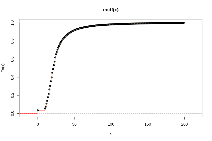
See the jump at 0 to approximately 10? I guess there are a lot of 0 values, so let’s see what happens to the dataset if we remove all the values of 0, what would be our new minimum value?
summary(aansub[aansub > 0])| Min. | 1st Qu. | Median | Mean | 3rd Qu. | Max. |
|---|---|---|---|---|---|
| 10.00 | 17.00 | 22.00 | 27.77 | 30.00 | 199.00 |
Now we know everything about our data distribution. Let’s decide on which values to use.
Statistical breaks
With the knowlegde of the data kind and the statistical distribution, I define my points of interest as follows:
[0, 10, 17, 22, 30, 50, 100, 200]
With :
- min :0
- real minimum: 10
- max : 1146
- decided max : 200
- median : 22
- first quantile : 17
- third quantile: 30
- end of boxplot : aprx 50
- end of histogram : aprx 100
The values between 0 and 9 are the same category. The distribution really starts at 10 until 100. All values above 100 are taken as the same category.
D3.js Color scales
Now we can use this knowledge to define our D3.js color scales. These are the 2 things you need to hard code in order to make a continuous MapboxGL fill and a corresponding D3 legend.
Notice that normally in D3.js you would use your whole data set to plot the scales , now we just define our range and breaks. We do not want to take all 6 million records to our front-end!
First define the stops that are of interest in the legend :
// Stops you want to use in paint and legend
const stops = [0, 10, 22, 30, 50, 100, 200];
Then decide , based on the statistical facts of the data, what kind of scale to use, and the values for the range.
D3.js offers a whole assortment of data scales to use. For this dataset I use the scaleDiverging scale in combination with the diverging color scales. Because you can give in any 3 numbers to return a diverging and skewed color interpolation!
We give our minium, median and max as decided:
// Statistically determined scale.
const colorScale = d3.scaleDiverging(t => d3.interpolatePuOr(1 - t))  //invert colors
  .domain([9, 22, 100]) // min, median , max/quantile
I give in 9 instead of 10 because otherwise all the values from 0 up and including 10 will get the same color. I want the values from 0 (2 untill 9 do not occur in the dataset) to get a different color then 10.
For our current dataset, the scaleDiverging is the most interesting visualization technique. Our histogram shows a very distinct median and skewed to both sides some interesting differences. The center of the diverging scale will be our median. Showing the “normal” situation in the Netherlands. High-rise buildings and industrial areas show up above the median, for they contain a lot of connections to the gas net. Single houses show up neatly around the median and mean. But high-rise is easily detected now! We are interested in the outliers, not the “normal” situation. So to both sides these extremes are highlighted with the diverging color scale.
Mapbox GL syntax
Of course we could use D3 color scales to print out our color range once and hard code that into our Mapbox style. But making a function out of producing the style syntax gives me more freedom to play with the numbers and different color scales. For example replacing the d3.interpolatePuOr with d3.interpolatePiYG.
Also the dashboard contains multiple data layers with different ranges and colors, a syntax function can be reused to return the correct MapboxGL paint syntax. Feel free to use it!
Notice that a
matchandsteppaint syntax need a extra default color in the range. But thestepneeds it in the beginning of the array of stops and thematchat the end..
Then we will loop over the stops to request their corresponding color and create a array of values and colors to build our style syntax with.
First I thought just taking a few stops would be sufficient for making the style syntax, because mapbox will also interpolate between the colors. But making more color stops creates a better correspondence with the D3 color scale. So using a d3.range of a 20 steps in the domain creates a 20 extra color definitions for the mapbox style. Then I merge this with the original stops, just to make sure those are included as well.
So this is what I ended up for making my syntax:
// Make color scales with D3ranges
function makeStyleSyntax(stops, attrName, expr) {
  //  Set up MapboxGL paint syntax
  let paint;
  switch (expr) {
    case "match":
      paint = ["match", ["get", attrName]]
      break;
    case "step":
      paint = ["step", ["get", attrName], "#000"]
      break;
    case "linear":
      paint = ["interpolate", ["linear"], ["get", attrName]]
      break;
    default:
      paint = "#fff"
      break;
  };

  // Create array for making style color stops
  let colorstops;
  if (expr === "linear") {
    // Increase amount of stops
    let
      min = d3.min(colorScale.domain()),
      max = d3.max(colorScale.domain()),
      steps = 20, //20 extra stops!
      datastep = (max - min) / steps,
      data = d3.range(min, max, datastep);

    // Make sure original stops are included in the range.
    let colorstops = d3.merge([data, stops]).sort((a, b) => { return a - b }); //Sort values
    //Unique values and number format
    colorstops = d3.map(colorstops, (d) => { return d }).keys().map((item) => { return parseFloat(item) });
  } else {
    // Do not do this for steps or matches of course!
        colorstops = newRange;
  };
  // Get the colors from our colorScale!
  for (let elem of colorstops) {
    paint = paint.concat(elem, colorScale(elem))
  };
  // For match add default value in the end.
  if (paint[0] === "match") paint = paint.concat("#000")
  return paint;
}
The outcome of the function is a correct Mapbox Style specification syntax for the paint property.
No need to write rgb or hex color syntaxes yourselves!
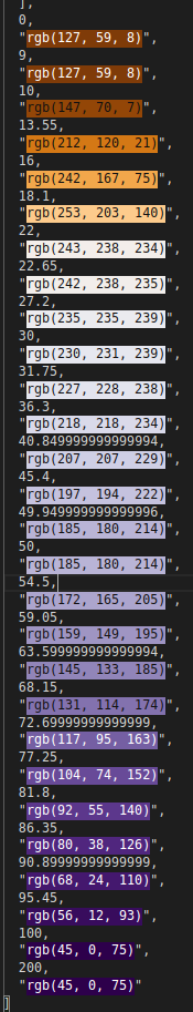
console.log(paint) >>
  [
  "interpolate",
  [
    "linear"
  ],
  [
    "get",
    "gas_aansluitingen_2020"
  ],
  0,
  "rgb(127, 59, 8)",
  9,
  "rgb(127, 59, 8)",
  10,
  "rgb(147, 70, 7)",
  13.55,
  "rgb(212, 120, 21)",
  16,
  "rgb(242, 167, 75)",
  18.1,
  "rgb(253, 203, 140)",
  22,
  "rgb(243, 238, 234)",
  22.65,
  "rgb(242, 238, 235)",
  27.2,
  "rgb(235, 235, 239)",
  30,
  "rgb(230, 231, 239)",
  31.75,
  "rgb(227, 228, 238)",
  36.3,
  "rgb(218, 218, 234)",
  40.849999999999994,
  "rgb(207, 207, 229)",
  45.4,
  "rgb(197, 194, 222)",
  49.949999999999996,
  "rgb(185, 180, 214)",
  50,
  "rgb(185, 180, 214)",
  54.5,
  "rgb(172, 165, 205)",
  59.05,
  "rgb(159, 149, 195)",
  63.599999999999994,
  "rgb(145, 133, 185)",
  68.15,
  "rgb(131, 114, 174)",
  72.69999999999999,
  "rgb(117, 95, 163)",
  77.25,
  "rgb(104, 74, 152)",
  81.8,
  "rgb(92, 55, 140)",
  86.35,
  "rgb(80, 38, 126)",
  90.89999999999999,
  "rgb(68, 24, 110)",
  95.45,
  "rgb(56, 12, 93)",
  100,
  "rgb(45, 0, 75)",
  200,
  "rgb(45, 0, 75)"
]
It is better with color highlighting so here is an image as well.
Nows we can use this paint in MapboxGL.js or to make a JSON style object. Just call the function as a paint object:
map.setPaint(layer,  makeStyleSyntax(stops, "gas_aansluitingen_2020", "linear"))
// OR
let layer = {
  "id": "chosenLayer",
  "type": "fill",
  "source": "source",
  "source-layer": "bag,
  "paint": {
      "fill-color": makeStyleSyntax(stops, "gas_aansluitingen_2020", "linear"),
      "fill-outline-color": "#BDBDBD"
  }
}

map.addLayer(layer)
It is not necessary to use the stops as input for the paint fill. You could also use the domain of the color scale. But I just want to make sure all values are included. When using a linear color scale with just 2 colors, the interpolation in MapboxGL will probably be sufficient to do the trick. But things get more complicated when you want to implement exponential of log interpolations on the color scale. Or use color scales with more then 2 colors. Then we need more color steps from D3 to pass to our MapboxGL style syntax.
This is the result:
Legend with D3.js
With the same stops and color scale we can make a corresponding legend.
Taking the full range of our defined stops we can make a continuos looking color legend. Since the data on the map is painted as a continuos color interpolation this is also the best way to visualize a continuous color scale legend next to the map.
By dividing our dataset range into a 100 steps we can draw a 100 rectangles that give the impression of continuous color legend. (same trick again)
//Start with defining the width, height and steps.
let width = 60,
    height = 300,
    min = d3.min(stops),
    max = d3.max(stops),
    steps = 100,
    datastep = (max - min) / steps,
    heightstep = height / steps
    ;

// Create new range of 100 steps between min and max.
let data = d3.range(min, max, datastep);
Now data contains an array of a 100 values between the min and max of our own defined stops .
Create an svg and append a 100 rectangles. The fill color will be made with our defined colorScale!
// Create SVG
let svg = d3.select(this.refs.myD3Div)
  .append("svg")
  .attr("viewBox", [0, 0, width, height])
  .attr("width", width)
  .attr("height", height)
  .style("overflow", "visible")
// Create a 100 rectangles with interpolating colors
let bars = this.svg.selectAll(".bars")
  .data(data, function (d) { return d; })
  .enter().append("rect")
  .attr("class", "bars")
  .attr("x", 0)
  .attr("y", function (d, i) { return i * heightstep; })
  .attr("height", heightstep)
  .attr("width", width / 2)
  .style("fill", function (d, i) { return colorScale(d); })
  ;
We define a linear y scale with our original stops and the range is the height of the svg. Now we can use this to place correct labels on the y axis.
The d3.axisRight function takes care of the label placement. As we decided before these contain the min, max, median and quantiles.
see that we use our stops here as the domain!
// Linear scale for y-axis
let yScale = d3
  .scaleLinear()
  .domain(d3.extent(stops))
  .range([0, height]);
// axis on the Right side
let axis = d3.axisRight()
  .scale(yScale)
  .tickValues(stops);

// Append the axis with our stops
svg.append("g")
  .attr("transform", `translate(${width / 2}, 0 )`)
  .call(axis);
And that is it! We can even visualize numbers that lie outside our defined color scale. To illustrate to the viewer that the numbers between 100 and 200 are all colored the same and can be presumed to be the same in meaning.
Any questions? Feel free to contact me!
Thanks to!
Thanks to my colleague Stephan Preeker for making the back-end, preparing the data and baking some vector tiles!
Inspiration :
- https://observablehq.com/@d3/diverging-scales
- https://observablehq.com/@d3/color-legend?collection=@d3/d3-scale
- Cartography Visualization of spatial data, Menno-Jan Kraak, Ferjan Ormeling.
- Complete idiot’s guide to Statistics, Rovert A. Donnelly