Diamond Painting Map Color Puzzle -- Tutorial!
This is a tutorial to make your own diamond painting map color puzzle!
I also talked about this in the Grote Geo Show have a look at episode 1.
It started with my sister making these Diamond Puzzle Paintings.. If you have no idea what it is check this video. The diamonds are little plastic squares of 2.5 by 2.5mm which you glue onto a grid with numbers, indicating which color to go where. So I thought: “Let’s do this with Map Data!”

In this tutorial I show how to make a A4 print covered with a 2.5mm x 2.5mm grid, containing your own data classification for coloring!
Of course you can also use this to do a paint by numbers, or draw by number, a very zen and long activity in these hard times or on holiday!
Feeling lazy? You can also download 2 here:
or Let’s go!
Download your favorite geo data and pre-process
I downloaded the Top10NL from the Netherlands here. So go ahead and find your geo data of your favorite home town and download it. The best is to use polygon data only. Preferably some data that fully covers the surface and does not have overlapping features!
The Top10NL data comes as big GML files. So first I loaded in all polygon features in Qgis and then exported them to GeoPackage files. I also threw away all attributes I don’t need all for faster processing later on.
So now I have some polygon layers:
- Buildings
- Water
- Terrain
- Roads
Classify the data
Decide upon your own classification. How many color values do you want in the end? I took 10. So from 0 to 9. ( I don’t like the double numbers, 11, 12 etc in my final print. You could change these in the end to letters but for processing we need numbers! ) Making more classes is a more difficult but maybe more fun puzzling! Less classes is easier and quicker. But I guess it also depends on the geo data you are using!
These are my preferred classes:
| value | class | color |
|---|---|---|
| 1 | buildings | red |
| 2 | agriculture | light green 1 |
| 3 | roads | grey |
| 4 | water | blue |
| 5 | sand | yellow 2 |
| 6 | heath | purple |
| 7 | railway | black |
| 8 | grass | light green 2 |
| 9 | forest | dark green |
| 0 | rest | beige |
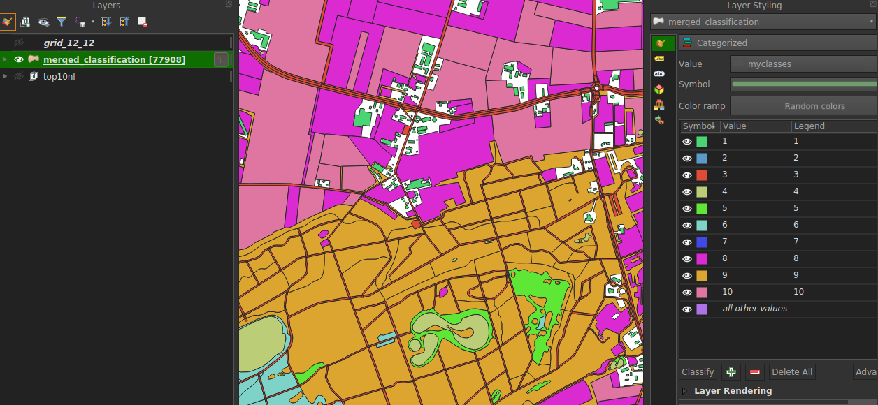
Give all the polygon layers a new field with the field calculator storing our custom classification system.
Per layer, make a field called myclasses and make sure it is stored as a numeric field, for example integer.
For my buildings all polygons are going to be one class. So as a value you can simply fill in: 1 .
If your classification depends on the feature attributes you might need some data expressions to fill your field. But make sure to use the same field name for all the different datasets and layers!
Merge data
Using the vector > Data Management tool > Merge Vector layers we are going to merge all our polygons into one data set.
Because we used the same field name for our classification in all our data layers this field will automatically be merged. Giving us a full covering classification.
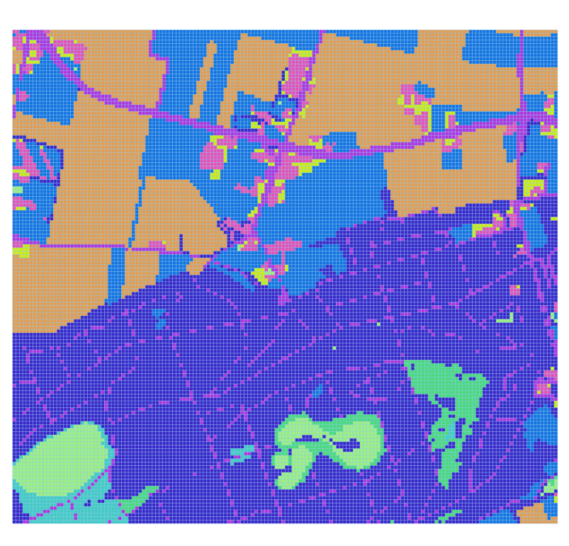
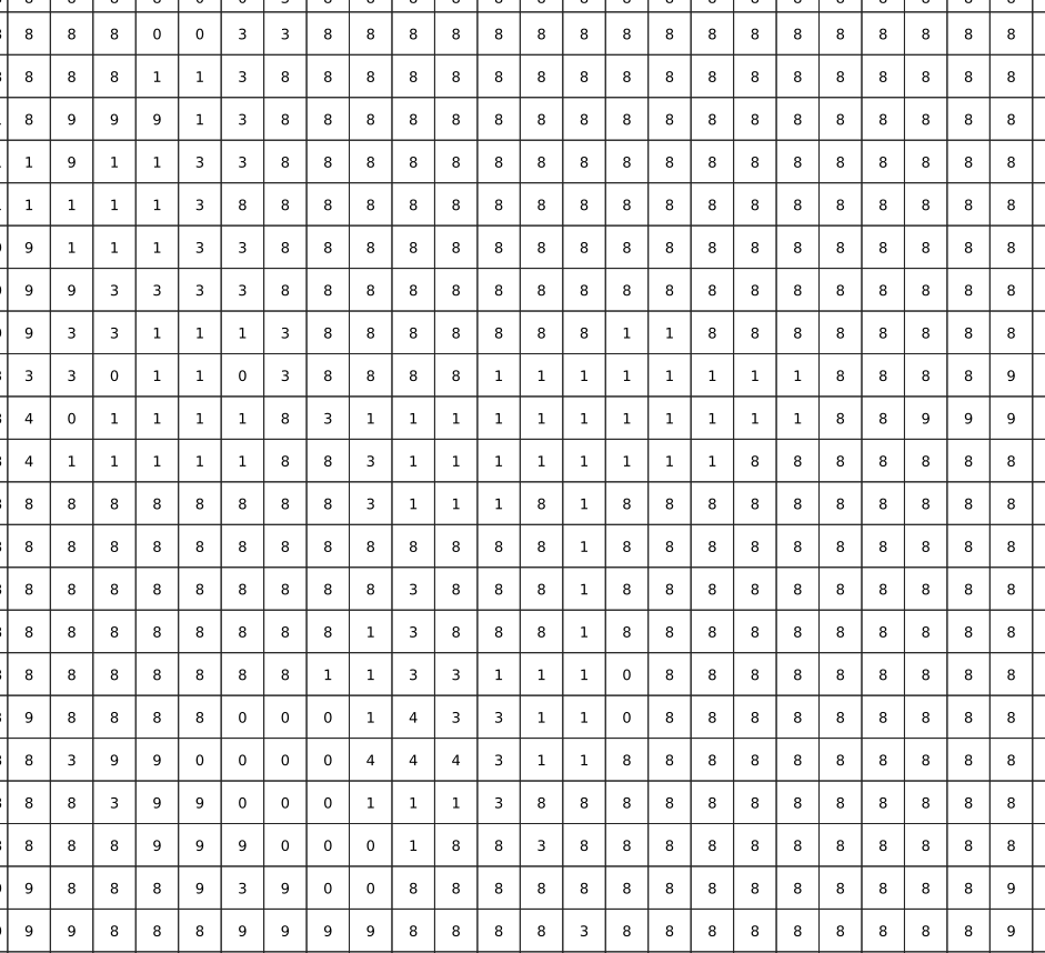
Now our data is ready! Check how your classification worked out by styling your merged layer on categorized and choosing our myclasses value.
You can throw away any other attributes!
Create grid
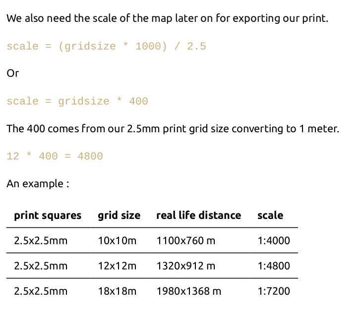
Our tiles have to be 2.5mm by 2.5mm when printing (size of puzzle diamonds). This mean that on a A4 paper of 297x210mm approximately 110 by 76 squares can be printed. (10 mm margins).
Giving us:
width: 110 squaresheight: 76 squares
So depending on how much area vs how much detail you want, we need to do some math. I took squares of 12x12 meter. To have enough detail. we can calculate the distances we can cover with this. By simply multiplying the amount of grids with our chosen size:
distance = width x grid size
110 * 12m = 1320 meters
We also need the scale of the map later on for exporting our print.
scale = (grid size * 1000) / 2.5
Or
scale = grid size * 400
The 400 comes from our 2.5mm print grid size converting to 1 meter.
12 * 400 = 4800
An example :
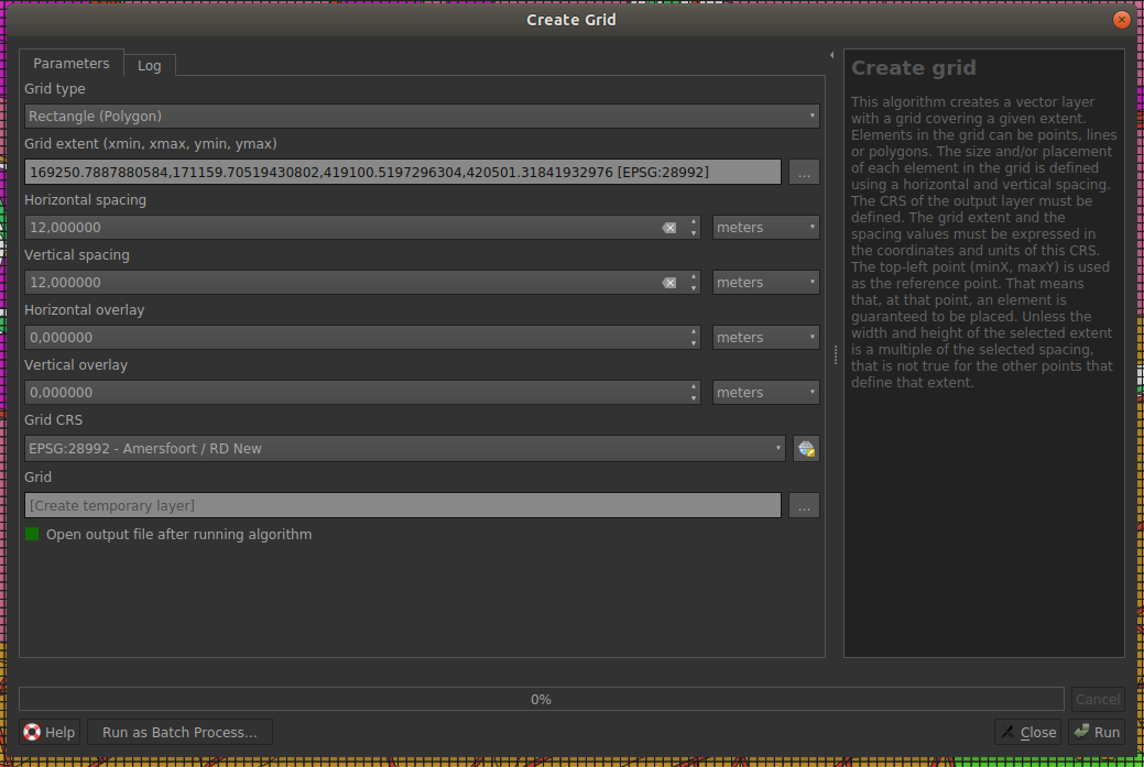
Create the grid in QGis
In QGis go to Vector > Research tools > Create Grid
Set Grid type to Rectangle
Zoom in to the area you want to print and choose your Use Canvas extent for the Grid extent.
Set your chosen value to Horizontal spacing and Vertical spacing . Make sure your units are in meters!
Run the tool!
Join attributes by location!
To get our classification into our grid we use Vector > Data Management tools > Join Attributes by location .
Settings:
Base layer : Your grid layer
Join layer : the merged data set with our custom classification.
Join type : set to one-to-one! I choose Take attributes of the feature with largest overlap only
See image:
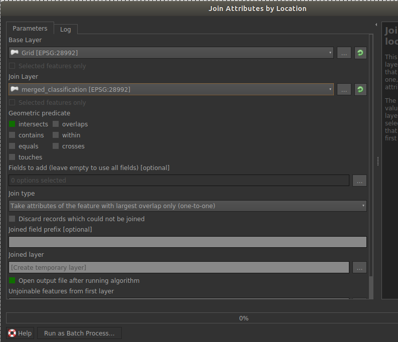
Run the tool!
Now there still is a possibility there are grid cells without a value. So with the field calculator we could give these a default number.
IF (myclasses IS NULL, 0, myclasses )
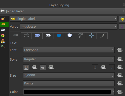
Styling the grid
In the styling panel change the Simbol layer type from Simple fill to Simple line
Change the line width to 0.08 millimeter!
Now add labels. Set the single labels to our class attribute. Take a very small font size : 6
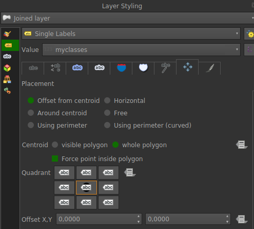
Go to the Placement tab and set the following settings:
Set all other layers to invisible.
Exporting
Now it is time to export our map!
Go to Project > New Print Layout.
Make sure your page properties are set to A4.
Add a map to the whole size of the A4 paper.
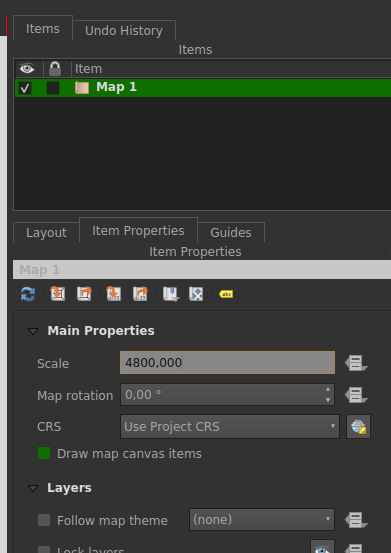
Select the map and in the properties set the Scale to your calculated scale.
Now replace the content of the map to the exact area you want. (the squares will not exactly fit on the edges, there will always be half squares on the edge.. )
Export your image as pdf!
Printing
When printing your pdf make sure the print settings DO NOT rescale your print! The square are exactly 2.5mm by 2.5mm when printing the pdf at 100% size. :)
All done!
Happy puzzling :)