Design Interactive Festival Map - WHY25
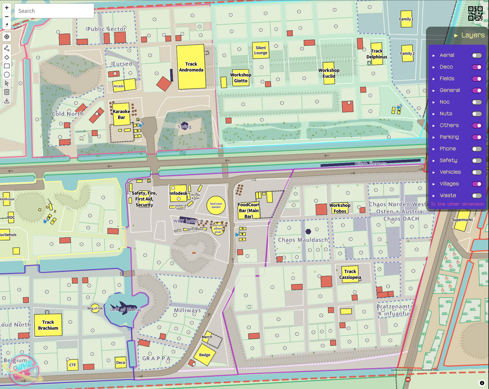
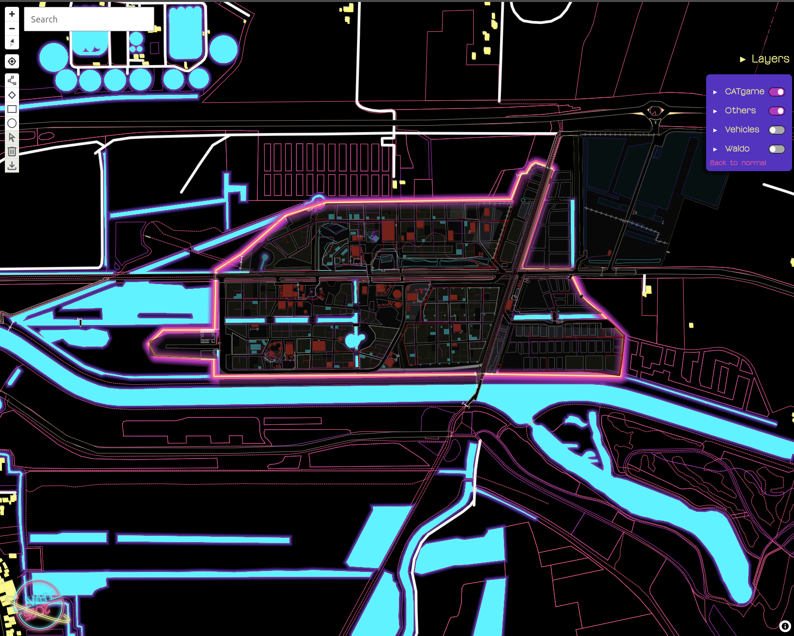
One of the challenges is the amount of layered information we had to show. The camp existed out of 5 fields, containing several clusters which then contain villages. Also tents could be from the organization, containing the official program, or used by villages or smaller “un"official program events. For visitors to navigate between all the different aspects of the different events going on, and visually understand the differences between a village tent and a conference tent I played around with layering the information and the labels.
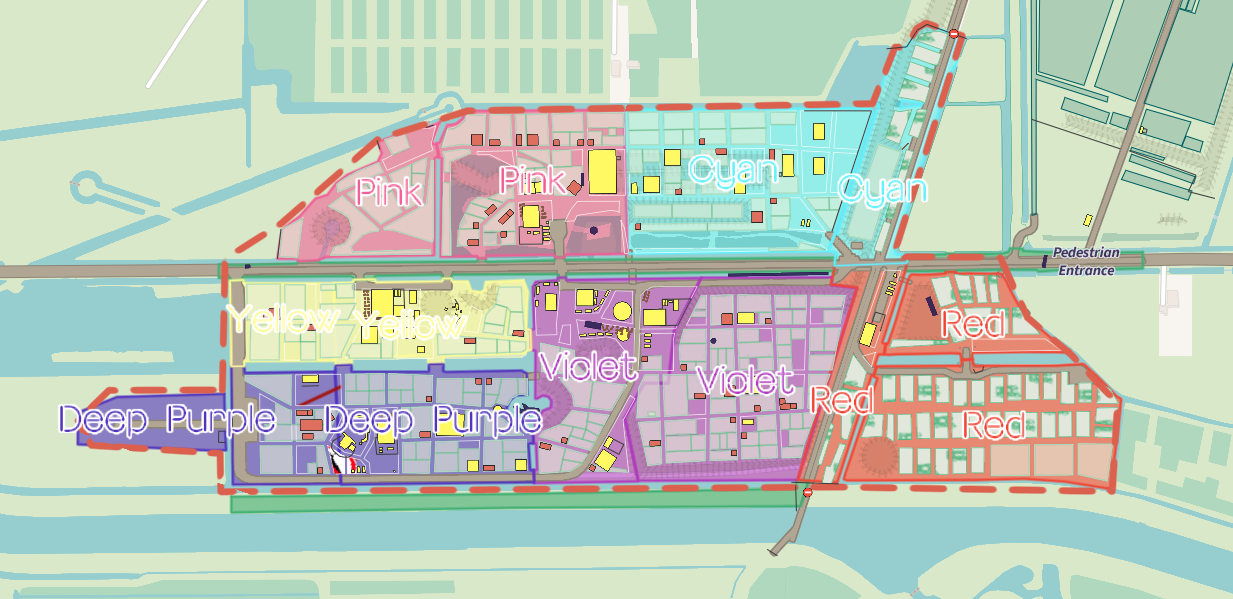
For example: the deco team decided to name the main fields after the colors of the events house style: Pink, Cyan, Deep Purple, Violet and Red. A visual nightmare to base a map on. By showing the field colors and names very large when zoomed out, the overview information could be found. When zooming in the color faded but the colored outline of the field remained. Only when zoomed in far enough the outlines would disappear. For they might be confusing when looking on street level and could be confused with cables or pipes.
Also the clusters where shown when zoomed out, and would disappear and make way for the villages to appear. Heaving a slight overlap in the icons of the villages appear first, and the label after, giving it a smooth transition of moving from cluster to village level. The clusters where still present by a dashed line around the villages in the cluster.
By layering the information over zoom levels, information gets introduced is smaller chunks, and zooming in, is a literal zooming into the more detailed information, zooming out is looking at the overal overview information.
All vehicles on the terrain where equipped with a GPS tracker and served through Traccar. The location also contained the motion/speed and rotation, therefore it was possible to style the icons on: wether they were in motion, yes or no. And which direction they went. Of course I forgot to make screenshots during the event, with all the different vehicles driving around. So this is a very minimal example of what it looked like.
The categories of Traccar where mapped to our own categories and I made icons for standing still and moving. Icons are based and ensembled by pictures designed by Freepik.com

Deliberately choosing gender neutral icons and rethinking binaries on this. Inspired by Meghan Kelly -feminist icon design
![]()
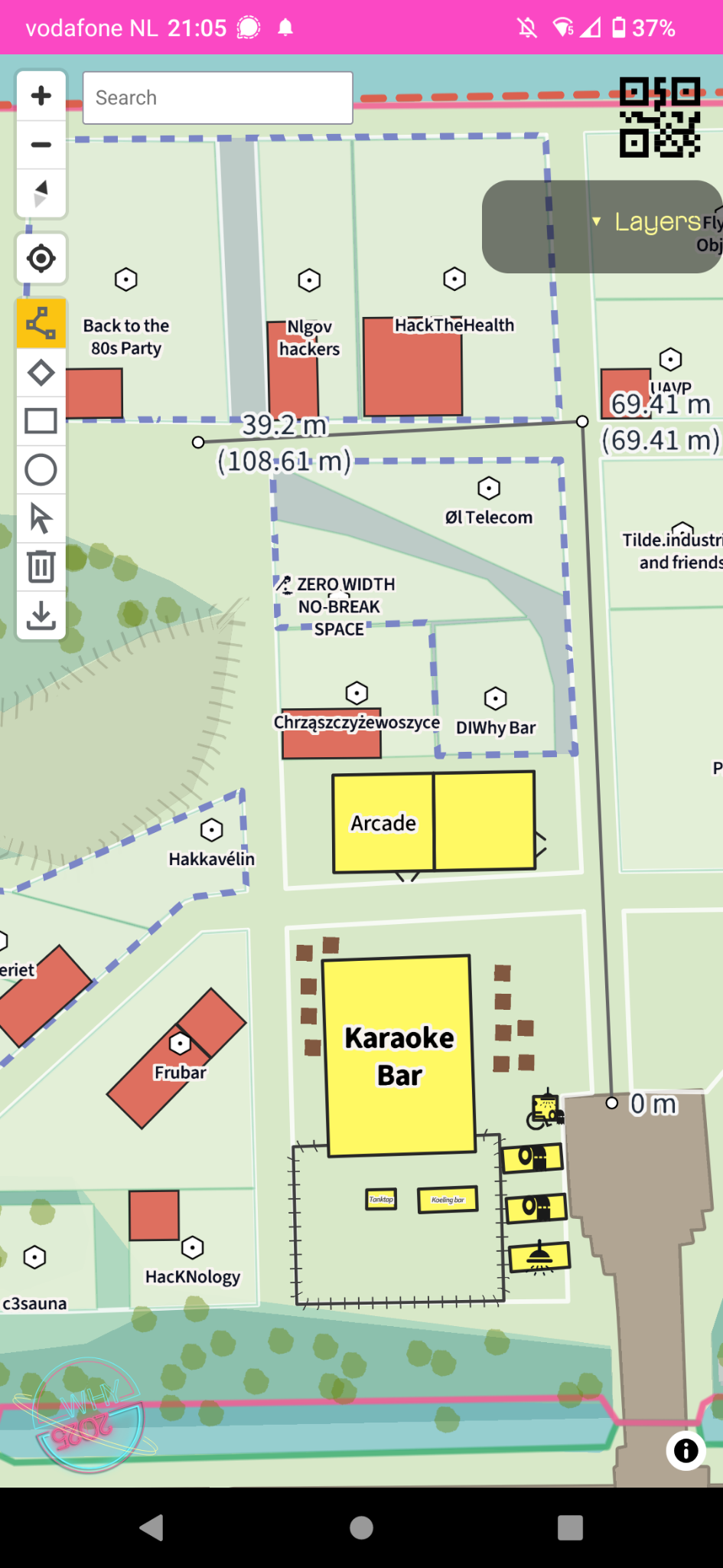
Phone layout and measuring functionality:
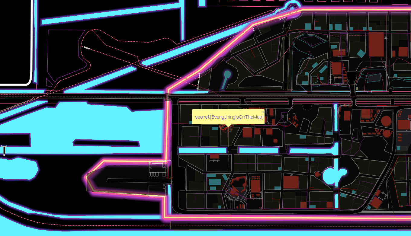
Some secrets and small games where hidden in another style layer called “The other dimension” Colors and themes were inspired by the house style of the event.
Gitlab repro : https://gitlab.com/why2025/team-terrain/draft-map-web/
